Line
FreeThe drawing every other style starts from: a single 1.2 outline with round caps and joins, nothing filled. It is the lightest style in the library, so a long toolbar or settings list still looks quiet.
Formats SVG, PNG, React, CSS, CDN
Pro Every tool, icon and stickerAll of Pro for $7.99/month
Each of the 4,309 icons is drawn once, on a 24 px grid. Our build then repaints that drawing into every style, so the same icon looks right whichever look your product needs, and you can switch styles later without hunting for replacements. Line are free for personal and commercial work. The other fifteen come with Pro.
Explore the icons See Pro plans
Pick an icon and watch the same drawing change. Single-colour styles take the colour you choose; the colour styles keep their own palettes.
 Duo
Pro
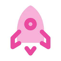 Flat
Pro
 Jass
Pro
 3D
Pro
 Lineal
Pro
Showing Rocket in all 16 styles.
The house style. Line is free; Solid and Duotone are Pro. Round line ends, round joins and soft corners on a 24 px grid.
The drawing every other style starts from: a single 1.2 outline with round caps and joins, nothing filled. It is the lightest style in the library, so a long toolbar or settings list still looks quiet.
Formats SVG, PNG, React, CSS, CDN
Every closed shape filled, with the inner detail cut out as a real hole instead of a white line painted over it. That keeps a Solid icon legible at 16 px and on any background.
Formats SVG, PNG, React, CSS, CDN
A 1.7 outline over a second tone at 20%, placed on the part of the icon that carries the meaning. The tone has its own colour setting, so the line can stay navy while the tone takes your brand colour.
Formats SVG, PNG, React, CSS, CDN
The same three drawings with the corners squared off, for interfaces built from hard edges.
Line with small corners squared, line ends cut flat and joins mitred. Circles and true curves stay round, so a clock is still a clock, but the overall feel turns precise and technical.
Formats SVG, PNG, React, CSS
The filled style with hard edges. Inner detail is still knocked out of the fill, so it reads at small sizes, while the square corners keep it from looking soft next to square buttons.
Formats SVG, PNG, React, CSS
A square-cornered outline over the same recolourable 20% tone as Duotone. It completes the Sharp family, and all three Sharp styles mix freely because they share one drawing.
Formats SVG, PNG, React, CSS
Each one rebuilds the shapes in its own way: a print, a pixel grid, a thick slab, a soft puff, a sketch.
No outline at all. The silhouette is a 40% tint and the details sit on top at full strength, like ink pressed into paper. It is still a single colour, so one change recolours tint and detail together.
Formats SVG, PNG, React, CSS
Each icon rebuilt cell by cell on the 24 × 24 grid: every unit is either filled or empty, so curves turn into steps. Shown at 24, 48 or 72 px, every cell lands on whole screen pixels and stays crisp.
Formats SVG, PNG, React, CSS
A 1.5 outline with the shape repeated twice underneath as a solid shadow, so each icon looks cut from a thick block. It carries far more weight than Line and holds up on posters and big buttons.
Formats SVG, PNG, React, CSS
Softer corners, a 1.5 stroke you can change, and a faint inner highlight that makes every shape look slightly puffed up. Friendly rather than technical.
Formats SVG, PNG, React, CSS
A sketch: a firm marker line plus a looser pencil pass at lower opacity, both with a slight wobble. The wobble is fixed per icon, so the same icon always comes out the same way.
Formats SVG, PNG, React, CSS
Colour without the work: every icon arrives in its own colour, in two tones of it.
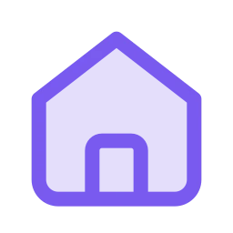

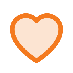
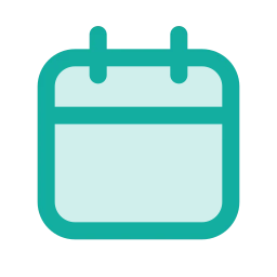


A 1.5 outline over a 20% tint of the same colour, with every icon given its own colour from a palette of eight. Related names share a colour, and one change recolours both tones.
Formats SVG, PNG, React, CSS





No outline: a tinted body with the details in full colour, each icon in its own colour from the same palette of eight. Closer to a small printed illustration than a line icon.
Formats SVG, PNG, React, CSS
Fixed palettes and renders. These are small illustrations rather than single-colour glyphs.




Little illustrations in a fixed navy and blue palette: a white-filled frame outlined in navy, details in blue and closed details in pale blue. It is the look of HubToolify’s own tool icons.
Formats SVG, PNG
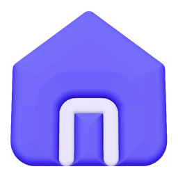


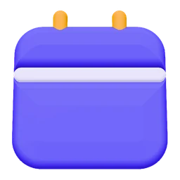

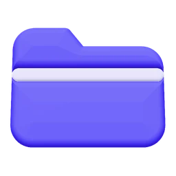
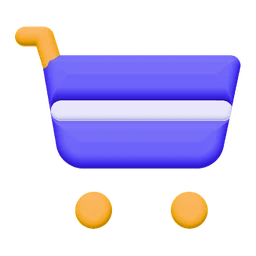

Rendered, not drawn: each icon is a small matte object in violet with orange and pink accents, upright or tilted into an italic three-quarter view. Delivered as transparent PNG up to 512 px.
Formats PNG up to 512 px




A deep plum outline over soft colour fills, each with a darker shade along one side, a small gloss and a few sparkles in the empty corners. Cheerful and detailed.
Formats SVG, PNG
How each style is built, how it takes colour, and where it fits best.
| Style | Family | Lines & fills | Colour | Corners | Best for | Access |
|---|---|---|---|---|---|---|
| Line | Rounded | Outline, 1.2 stroke | One, follows text colour | Rounded | Navigation, toolbars, forms at 16–24 px | Free |
| Solid | Rounded | Filled, details knocked out | One, follows text colour | Rounded | Selected tabs, likes, small buttons | Pro |
| Duotone | Rounded | Outline over a 20% tone | Two, set separately | Rounded | Feature lists, empty states, onboarding | Pro |
| Sharp Line | Sharp | Outline, 1.2 stroke | One, follows text colour | Square | Developer tools, dashboards, finance | Pro |
| Sharp Solid | Sharp | Filled, details knocked out | One, follows text colour | Square | Active states in a Sharp interface | Pro |
| Sharp Duotone | Sharp | Outline over a 20% tone | Two, set separately | Square | Feature sections in square-edged products | Pro |
| Imprint | Signature | Tinted silhouette + solid details | One (tint + full) | Rounded | Portfolios, editorial, feature cards | Pro |
| Pixel | Signature | Square cells, no curves | One, follows text colour | Stepped | Games, retro and terminal themes | Pro |
| Slab | Signature | 1.5 outline + solid shadow | One, follows text colour | Rounded | Hero sections, posters, kids’ products | Pro |
| Mellow | Signature | 1.5 stroke + inner highlight | One, follows text colour | Extra round | Consumer, wellness, education apps | Pro |
| Draw | Signature | Marker + pencil pass | One, follows text colour | Hand-drawn | Journals, handmade shops, personal blogs | Pro |
| Duo |
Duo & Flat | Outline over a 20% tint | Own colour per icon (8) | Rounded | Colourful feature grids and menus | Pro |
| Flat |
Duo & Flat | Tinted body + full-colour details | Own colour per icon (8) | Rounded | App launchers, category tiles, slides | Pro |
| Jass |
Colour | Navy frame + blue details | Fixed navy & blue | Rounded | Empty states, onboarding, marketing | Pro |
| 3D |
Colour | Rendered matte object | Fixed violet palette | Soft 3D | Landing pages, pricing, app-store art | Pro |
| Lineal |
Colour | 1.5 plum outline + colour fills | Fixed palette, 8 fill pairs | Rounded | Landing pages, kids’ and education | Pro |
A few rules of thumb. Because every style shares one drawing, you can also mix them: Line for the toolbar, Solid for the selected tab, Duotone for the feature list.
Use Line at 16–24 px, with Solid for the active state. Line is free; Solid is Pro.
The Sharp family. Rounded icons look soft next to hard edges; Sharp Line matches them.
Duotone for your brand colour on the tone, or Duo when every item should get its own colour.
The free Line style is on a public CDN and on npm. Solid, Duotone and the other Pro styles come in the Pro kit and the Pro packages.